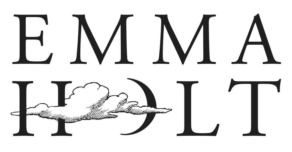
Emma needed a logo to represent her personal photography style. The ‘O’ in her name was transformed into a crescent moon, which was then combined with a cloud. This choice perfectly complemented the ethereal atmosphere of her work.
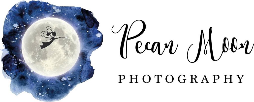
Pecan Moon uses magical costumes and woodlands to create children’s photography, that truly has a fairytale feel. This logo was created to play on the magical, storybook feel of the end product.
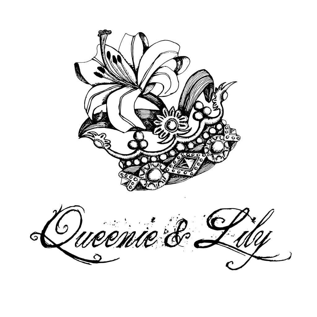
Queenie and Lily create accessories for all occasions. They wanted a hand-illustrated logo with a focus on using pen and ink. An antique feel to the line work on the logo and type was important to strengthen the message that modern, handmade jewellery can still be timeless.
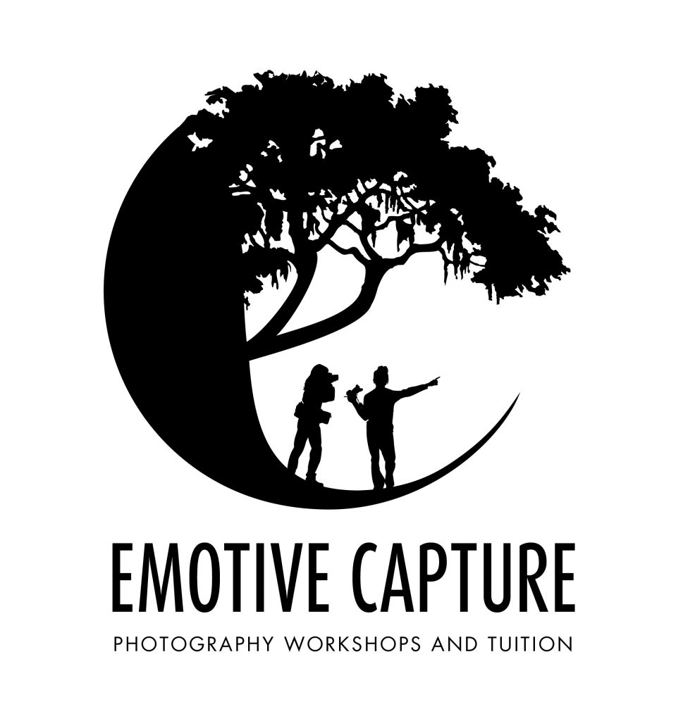
My client wanted an illustrated logo that used the letters of the company name and also showed that it was a
1-2-1 outdoor photography tutorial/lesson-based company.
The letter C was slightly changed using a tree, which also created the letter ‘e’. Tricky but not impossible!
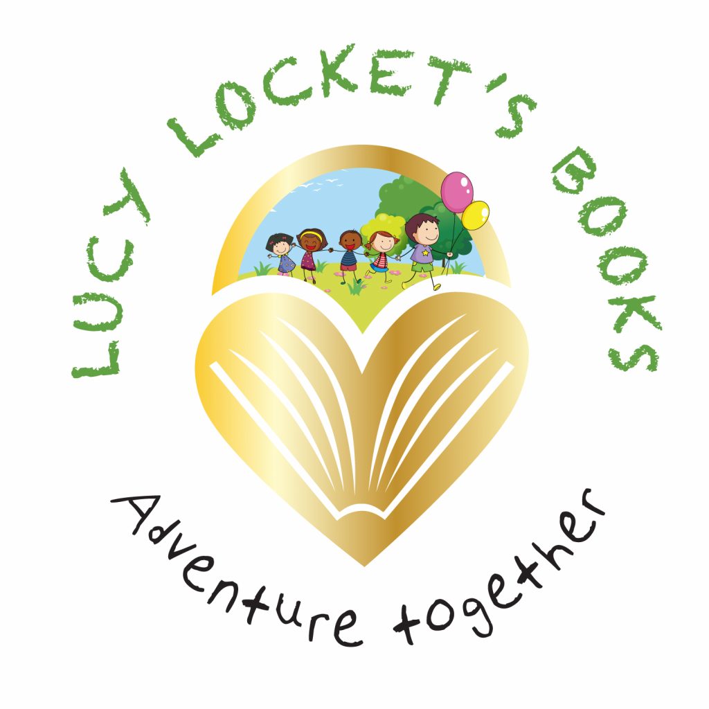
Lucy Locket’s Books is a part of a bookselling franchise. Each ambassador is able to create their own identity. Lucy asked me to create something on a small budget.
This is always an option for anybody starting out with a smaller budget. To make things quicker, stock can be used, although it is usually mixed in with bespoke elements. (Such as the heart-shaped lock, with highlights of a book and its pages in it.)